01 · The challenges
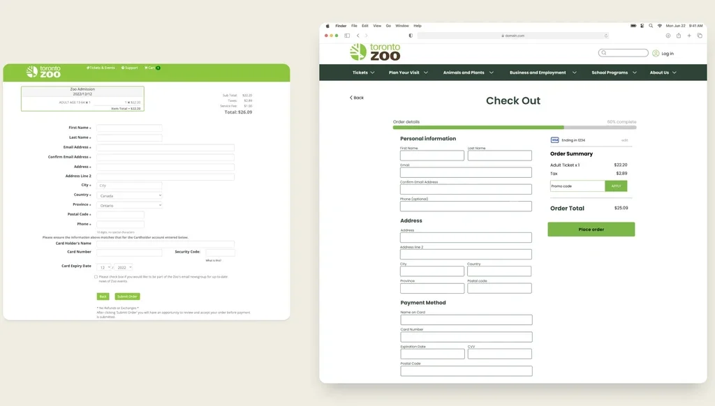
No saved user data. Users had to repeatedly enter personal and payment information with each ticket purchase, increasing frustration and time consumption.
Outdated website design. The old website lacked an intuitive flow and the navigation was confusing, leading to a negative user experience and difficulty finding key sections.
02 · The results
03 · Research & discovery
I began with an in-depth analysis of both business and user goals, revealing that ticket purchases were the primary focus for users, directly impacting zoo revenue. Through individual and group card sorting exercises, I reorganized the website's information architecture to ensure users could navigate to key sections within three clicks, with login options readily accessible.
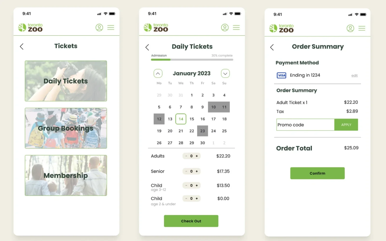
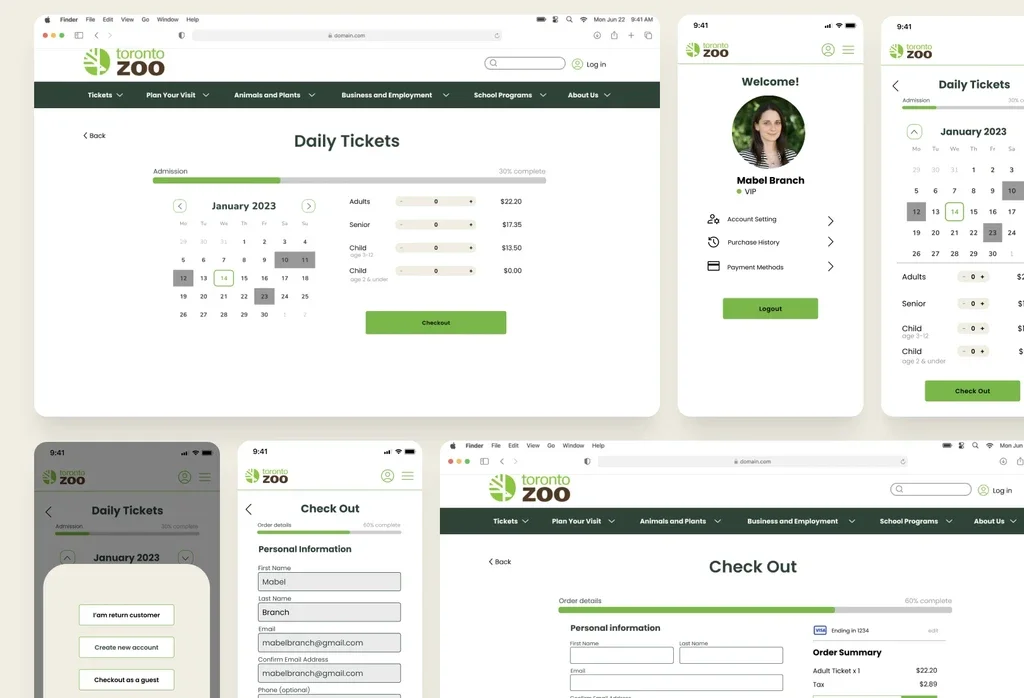
I then mapped out the streamlined ticket purchasing task flow, allowing users to save their personal and payment information in accounts for quicker future transactions.

04 · Design & development
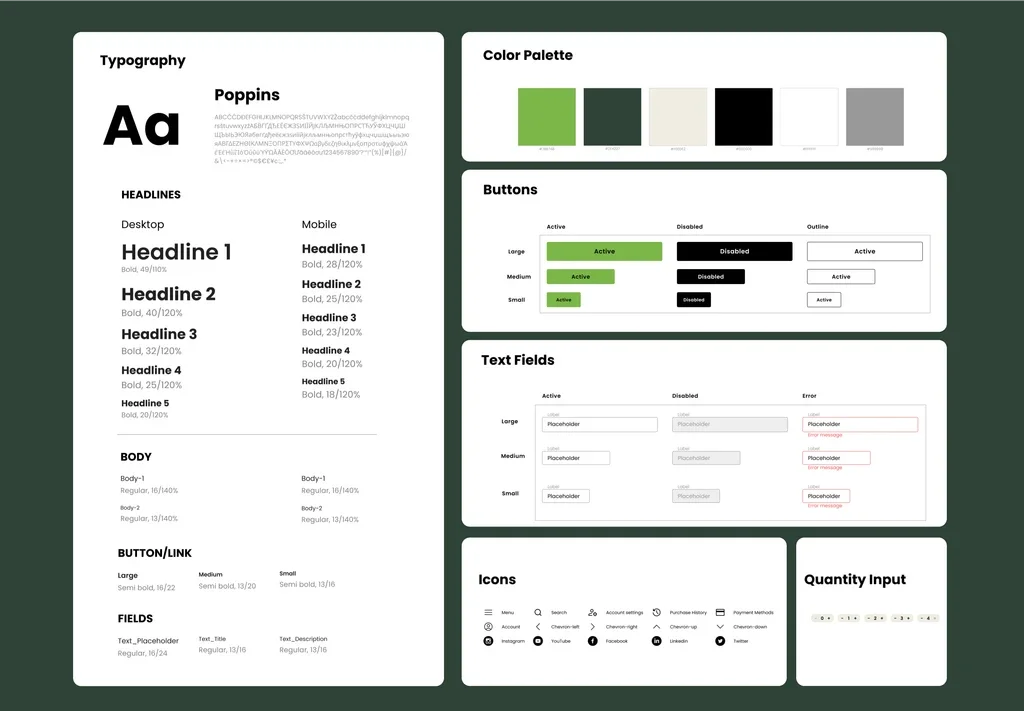
I designed wireframes for essential pages, such as login, account, and ticket purchase, streamlining the user journey. This included features like account creation and social media logins, all aligned with a consistent UI style guide that enhances usability and reflects the brand's identity.
The UI style guide focused on improving accessibility and creating a fresh, cohesive design that aligns with the zoo's goals, establishing a cohesive visual identity.
05 · Conclusion
Usability testing is essential in uncovering user pain points that may not have been initially anticipated. By implementing guest checkout and making the navigation easier, we significantly improved the user experience. Testing early and often allows us to refine the design for real-world application.